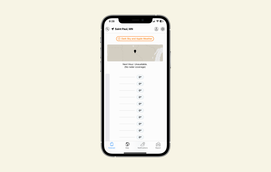
Today we pour one out for Dark Sky, one of the great mobile apps. When it launched, Dark Sky represented the best of iOS for me in two ways:
- It did one thing well. Modern iOS apps are little worlds of hierarchy and bespoke navigation structures. In the iPhone’s salad days the best apps transformed your phone, each into a different single-purpose device. For Dark Sky, that thing was telling you if it was going to rain in the next hour.
- Behind that simple UI was a ton of complexity and computation, which as a user you didn’t have to think about. This was another piece of the iPhone’s magic — it did a lot of computing but didn’t feel like a computer. As much as possible was abstracted away into a UI focused on giving you just enough to do what you needed.
Weather apps are UI designer bait: a perfect little constrained world where it’s obvious what the job is, but the variations on how to do it are endless. Dark Sky added complexity over the years, but remained one of the best — simple enough for my 3-year-old to read when she’s picking out her clothes in the morning. She’s very much not sold on our transition to Apple Weather.